


Ouigo
testing and improving a transportation mobile app
I have observed a lot of people complaining about the low-cost train service of the SNCF: OUIGO.
After the poor customer service and train delays, the app seems to be the biggest source of complaints. I decided to dig deeper into its usability issues and what alternatives I could propose to improve the user experience.
I conducted usability and heuristics studies, identified the main users’ pain points and designed solutions on Figma for the most problematic tasks. I then evaluated their usability and viability compared to the initial design.
The evaluation score was unequivocal and my version obtained flying results!
Timeline
Sept 2020
Company
Ouigo (SNCF)
Team
just me
Role
UX-UI Designer
Skills
UX research / App Design / UI design / Customer experience
Tools
Excel, Figma, IOS, Android, Google materials, Adobe CC
Link
How to improve an application's user experience?
1
Conduct research to identify the problems.
2
Prioritise features to revisit and prototype solutions
3
Test, Iterate, and Validate
Conduct research to prioritise the features to revisit
Context
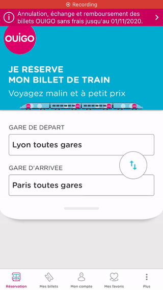
In September 2020, I conducted a series of research to understand and assess the issues experienced with the app. The latest app version was 6.2.3 at that time.
What I can do:
-
test the existing app
-
evaluate users' experience and satisfaction
-
observe the user journey first-hand
-
retrieve the brand guidelines and app assets
-
design a functional prototype to be tested
What I don't know:
-
the company's point of view and strategy
-
the analytics and data on customers' types
-
the reason behind design choices and insight into the development team
-
data on previous tests and feedback
-
current app KPIs
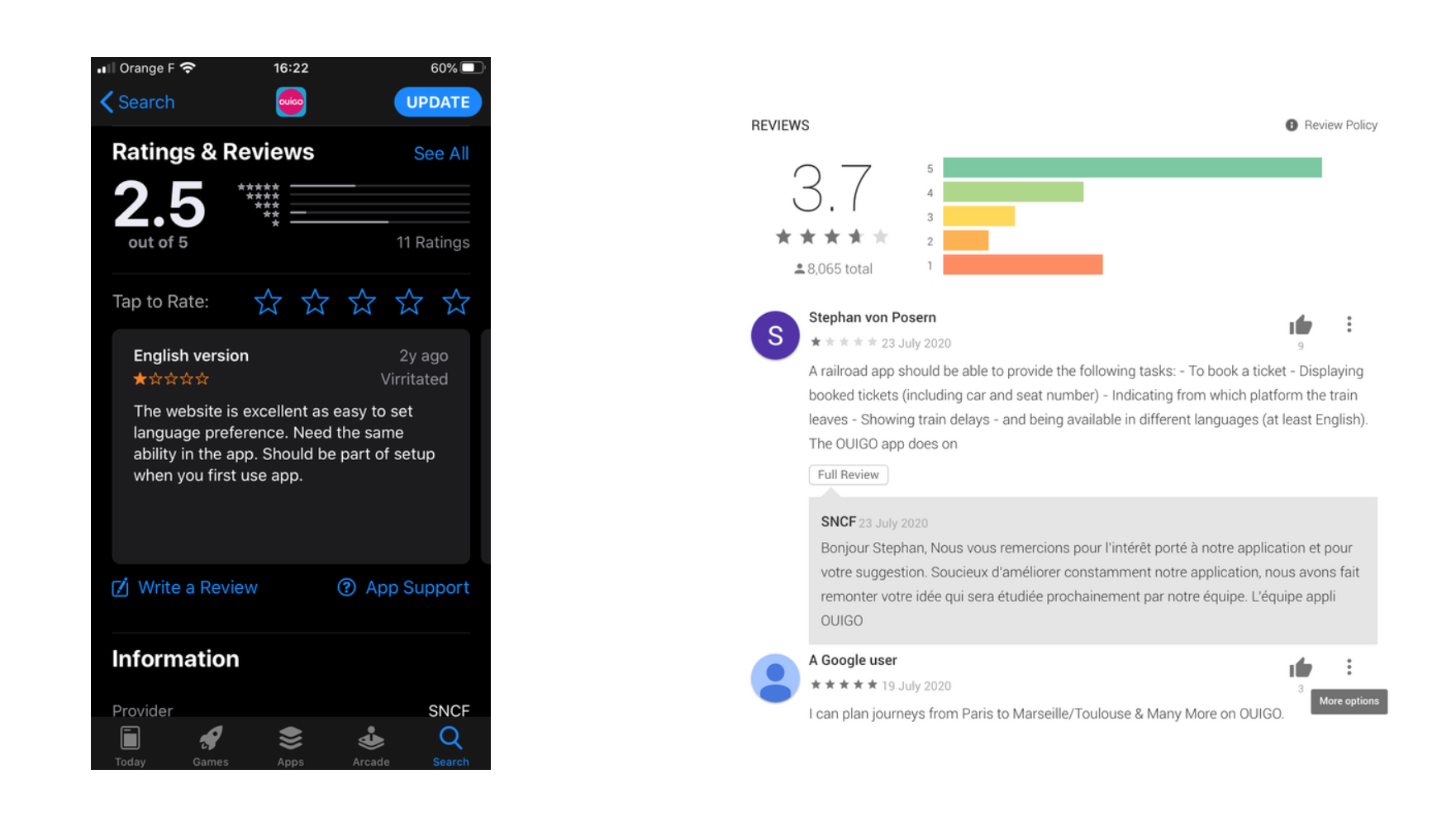
Reading Reviews
Going through the app reviews for both IOS and Android users provided me with a rich amount of data to start from.
Even if some reviews might be outdated in the latest app version, this gave me a good understanding of what the main app issues might be.
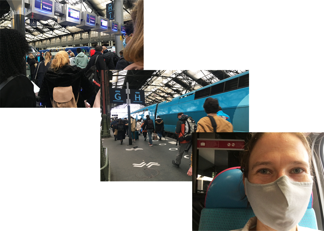
Contextual Observations and Interviews
I immersed myself in the customer experience and booked a train ticket. During my journey, I collected first-hand observations and testimonials.
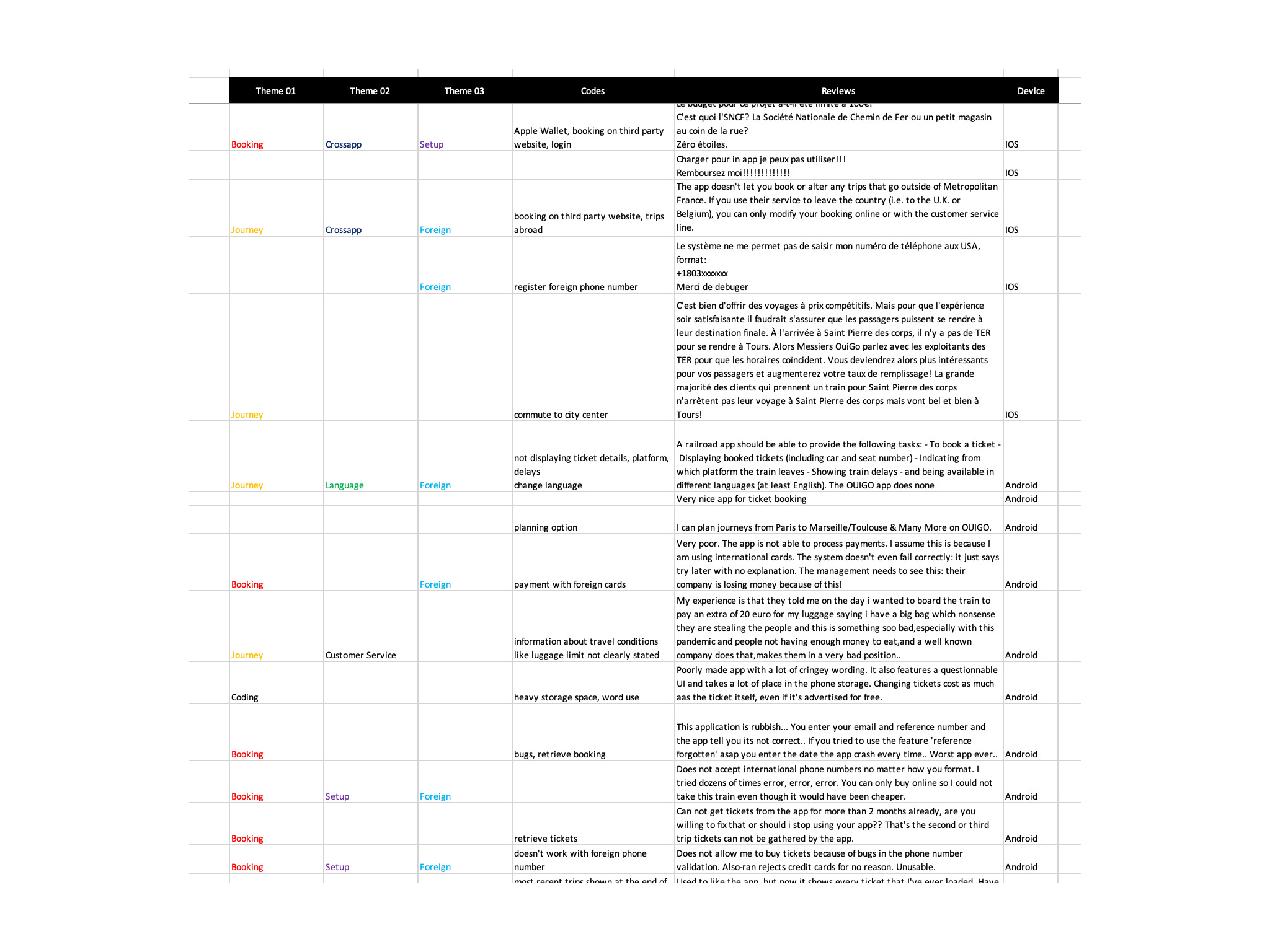
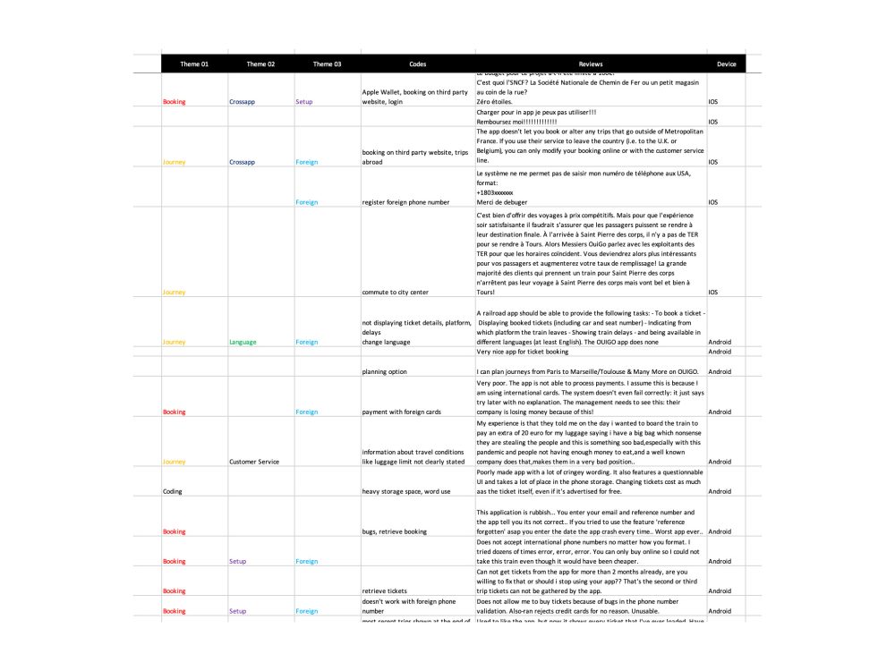
Thematic Analysis
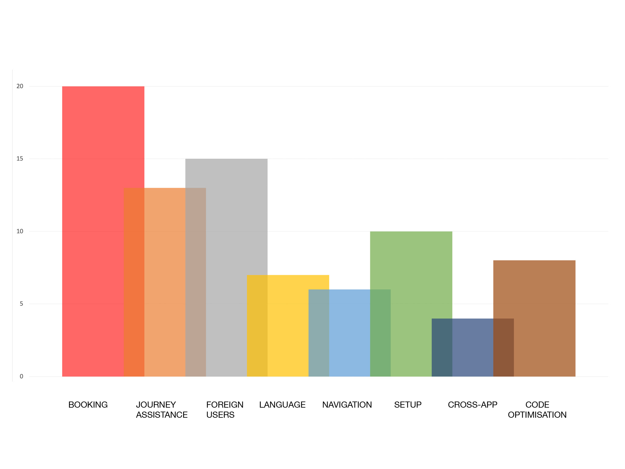
I gathered all the collected feedback and observations into a table, coded them and classified them into themes.
The recurring themes are Booking, Setup, Language, Cross-app communication and Foreign travellers.

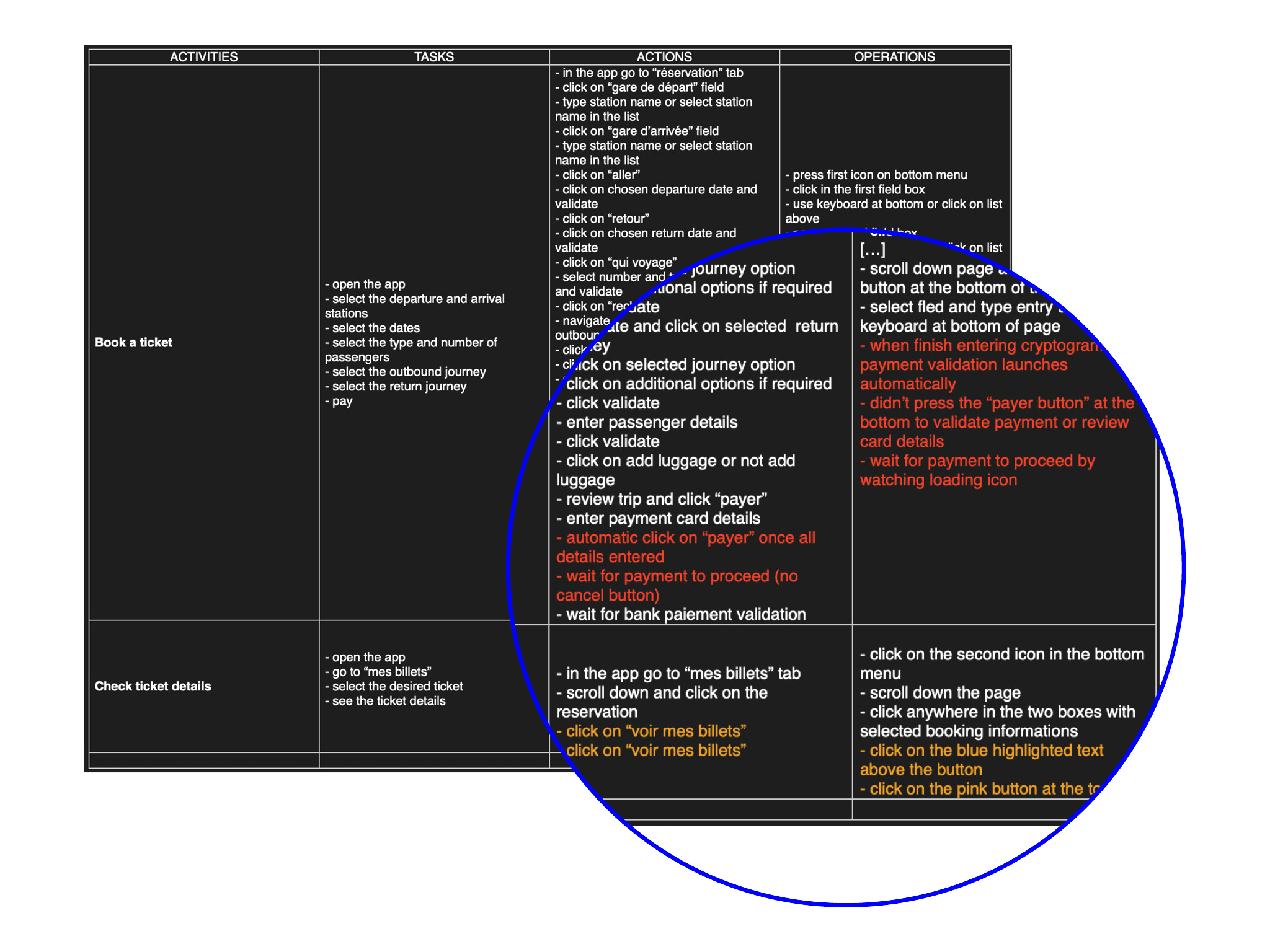
Activity-centred study
From the qualitative study, I decided to concentrate on and break down the following tasks on the app that seems to be the most problematic: setting up a profile, booking a ticket, to access ticket details.
Activity 1: Book a ticket
Activity 2: Retrieve booking
Activity 3: Check ticket details
Identified issues
-
the app doesn’t work offline
-
the head banner takes up too much space, preventing easy filling of some of the forms.
-
low consistency and standards as similar actions don’t use the same visuals systems
-
low efficiency in some tasks due to the large number of steps
-
the non-French speaker was not able to perform most of the tasks due to the language barrier.
Prototype the new features
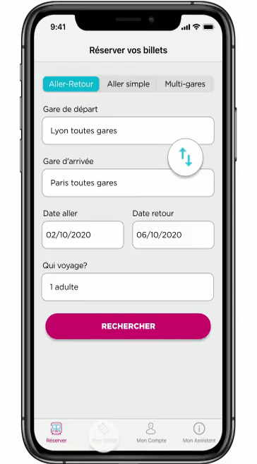
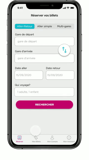
Feature #1: Booking a ticket
Situation:
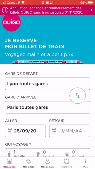
The user decides to book train tickets for a weekend trip. They open the app which opens on the “réservation” tab. They want to quickly check the prices for a specific time before deciding whether or not they want to book the tickets. They find navigation difficult and filling out the form is hard as half of the screen is taken up by a static image. Users with smaller screens find it almost impossible to navigate. Some of them give up and decide to book the tickets on the computer, sometimes going to oui.sncf and booking other services tickets.
Problem:
There is a large number of steps before accessing the available journeys. The animation moving pages back and forth increases the sensation of slowness as the user constantly comes back to the same page. The layout makes it difficult to navigate and fill out the form.
Possibilities:
Remove the header image. Reduce the number of steps, change the animation to increase the feeling of progression or design a step-by-step process. Change the word “réservation” which might imply that this is where all the user’s bookings are to “Réserver” which implies action to book a ticket.
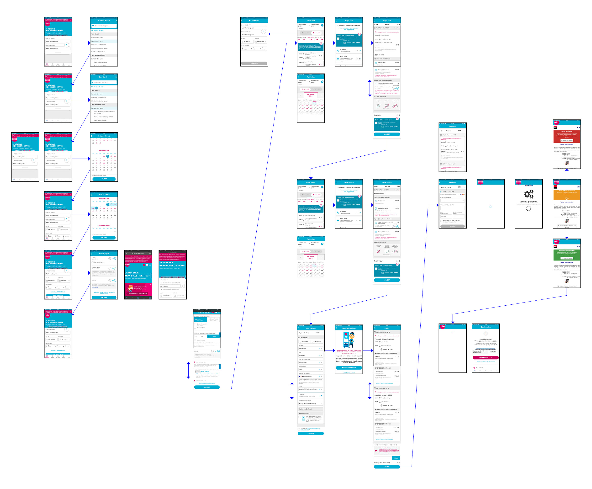
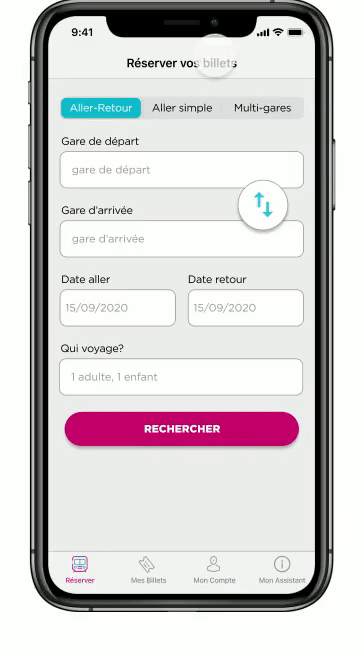
Proposition
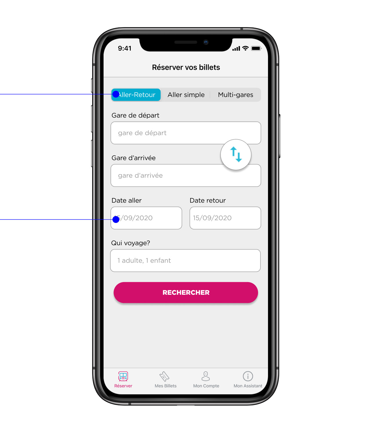
-
I added tabs to choose from Return, One way or multi-stop journeys allowing you to select the type of journey quickly. It was initially impossible to book a one-way ticket without reinstalling the app (as once you select stations once, they stay in the cache).
-
I reduced the number of actions in the selection of stations and dates which speeds up access to the available trains.
-
I changed the animation between pages from a back-and-forth slide to an up-and-down slide to suggest a progression.
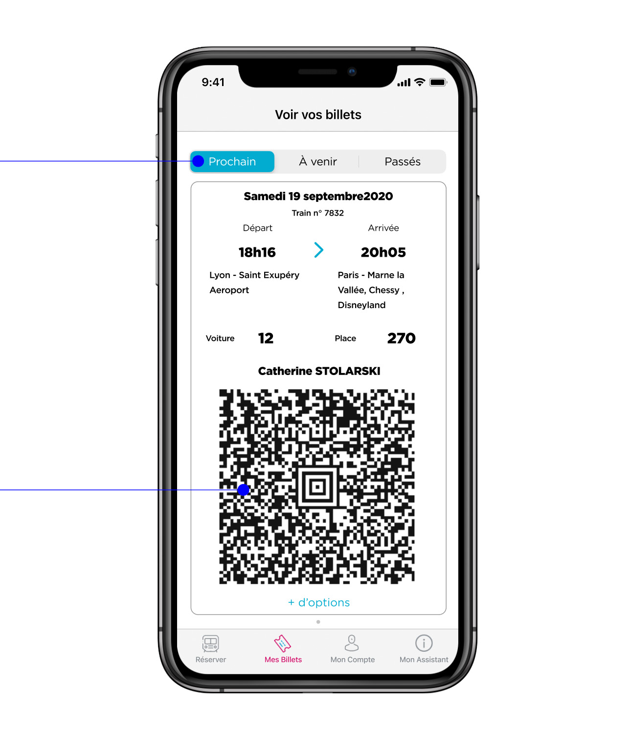
Feature #2: Check ticket details
Situation:
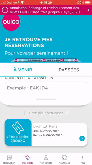
The passenger has to hurry up to catch their train. They speed up through the station and carry a bag, a suitcase. They need to quickly check to remind themselves what time is their train again, and to compare with the departure board if the train number is correct. And what seat do they have? They open the app again to check. 10 minutes later, they realised that they haven’t checked their carriage number and they have to check their ticket again. It is very difficult to click through all of the steps to see the ticket details. Once on the train, they realise that they can’t open the app offline which causes stress for not being able to show ticket if controlled. They also can’t add the ticket to native apps like Wallet to access offline.
Problem:
The path to check the ticket details is tedious, the passenger needs to go through 5 pages before accessing it and has to stop to do so as this is nearly impossible to perform while walking and carrying luggage.
Possibilities:
Reduce the number of steps to access tickets, add a tab with the next journey’s ticket displayed, make parts of the app as accessing tickets available offline, and add an option to save tickets into a native app.
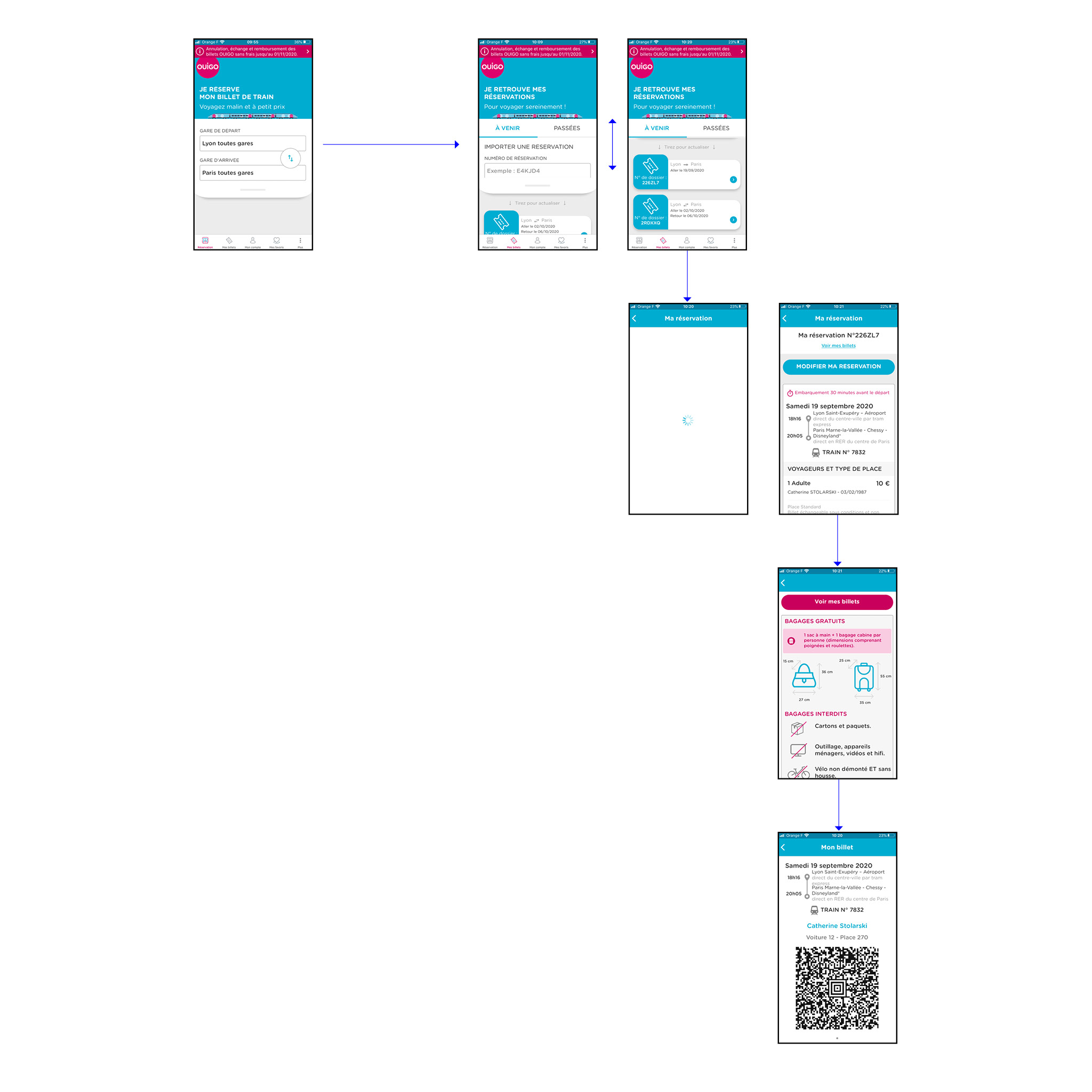
Solution
-
In order to have quicker access to the train ticket before and during a journey, I added a “next train” tab in the first position.
-
As soon as the passenger clicks on the “My tickets” tab, they can access their ticket details, reducing the number of clicks from 4 to 1!
-
Furthermore, by selecting more options, the passenger can add luggage, modify the booking or access the rules and conditions for boarding and the journey.
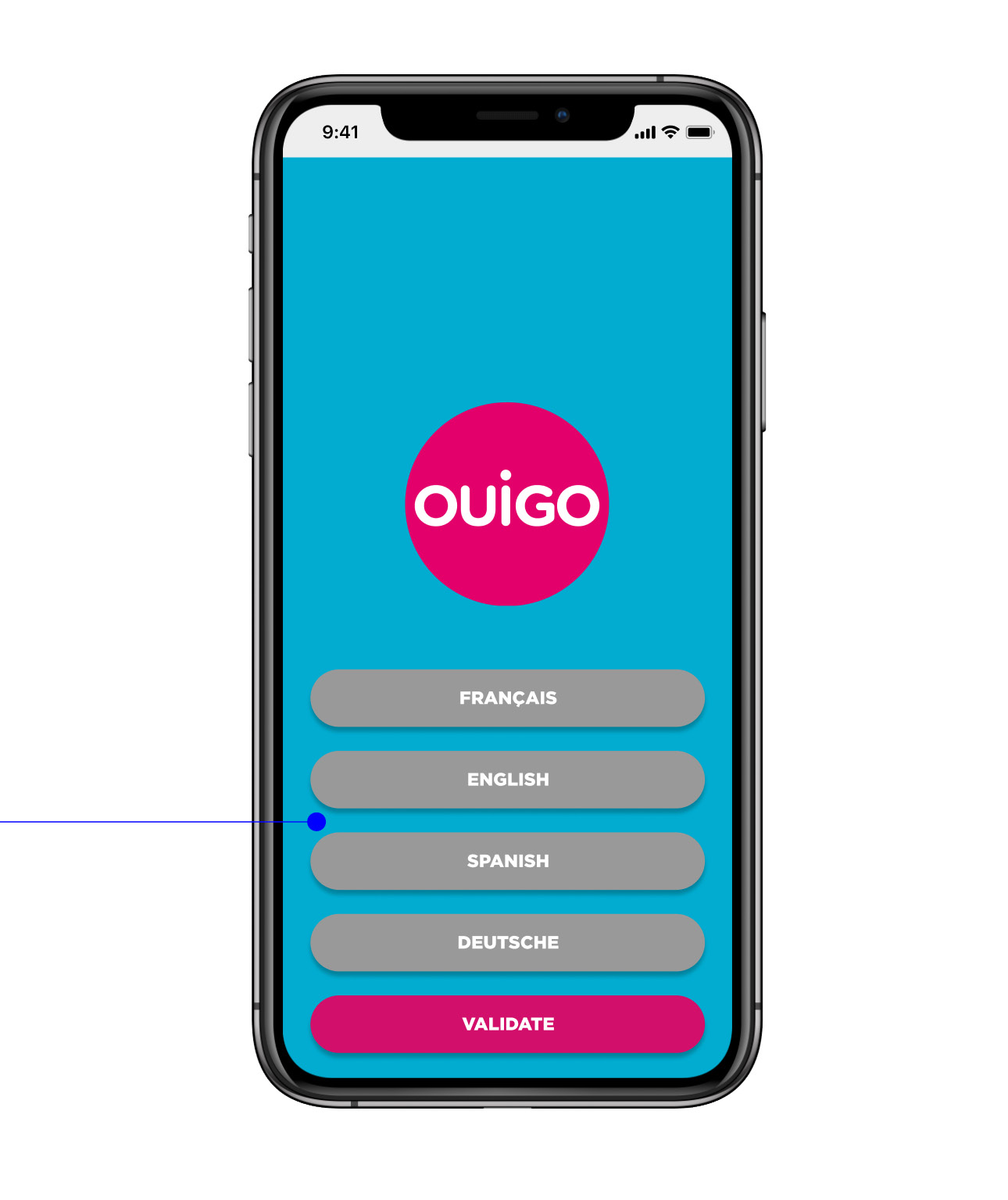
Feature #3: Choosing a language
Situation:
France is the 1st most visited country in the world. Tourists who want to see around book their tickets on the oui.sncf website which has an English version. There, they can’t really see the difference between the different types of services and could go for the cheapest offer. When receiving their booking confirmation, they realise that their ticket is accessible on the OUIGO app so they download it. Once on it, they can’t find any language option and thus can’t use the app, usually, they end up just printing their tickets. They feel confused as to why they had to go from one booking website to a different app and feel not considered and rejected by the OUIGO service.
Problem:
Foreign users who don’t speak or have a limited level of French can’t use the app at all. It is very likely that after their first experience, they will not use OUIGO ever again.
Possibilities:
Design a language picker when installing the app, and add language choices in-app settings (add app settings).
Solution
-
I created a welcome animation and a language menu available when installing the app.
-
The language options could also be accessed in the App Settings that I added to the App Architecture.
Building the features in
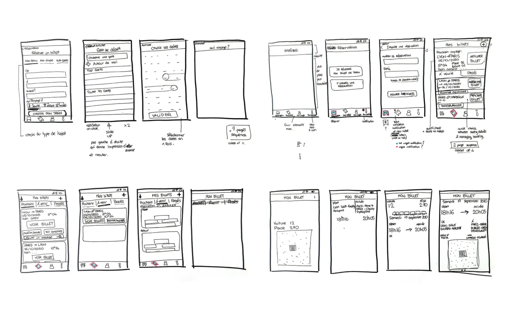
Low-Fi Wireframes
I started by sketching wireframes to get a better idea of how to organise the content on each page and compare iterations.
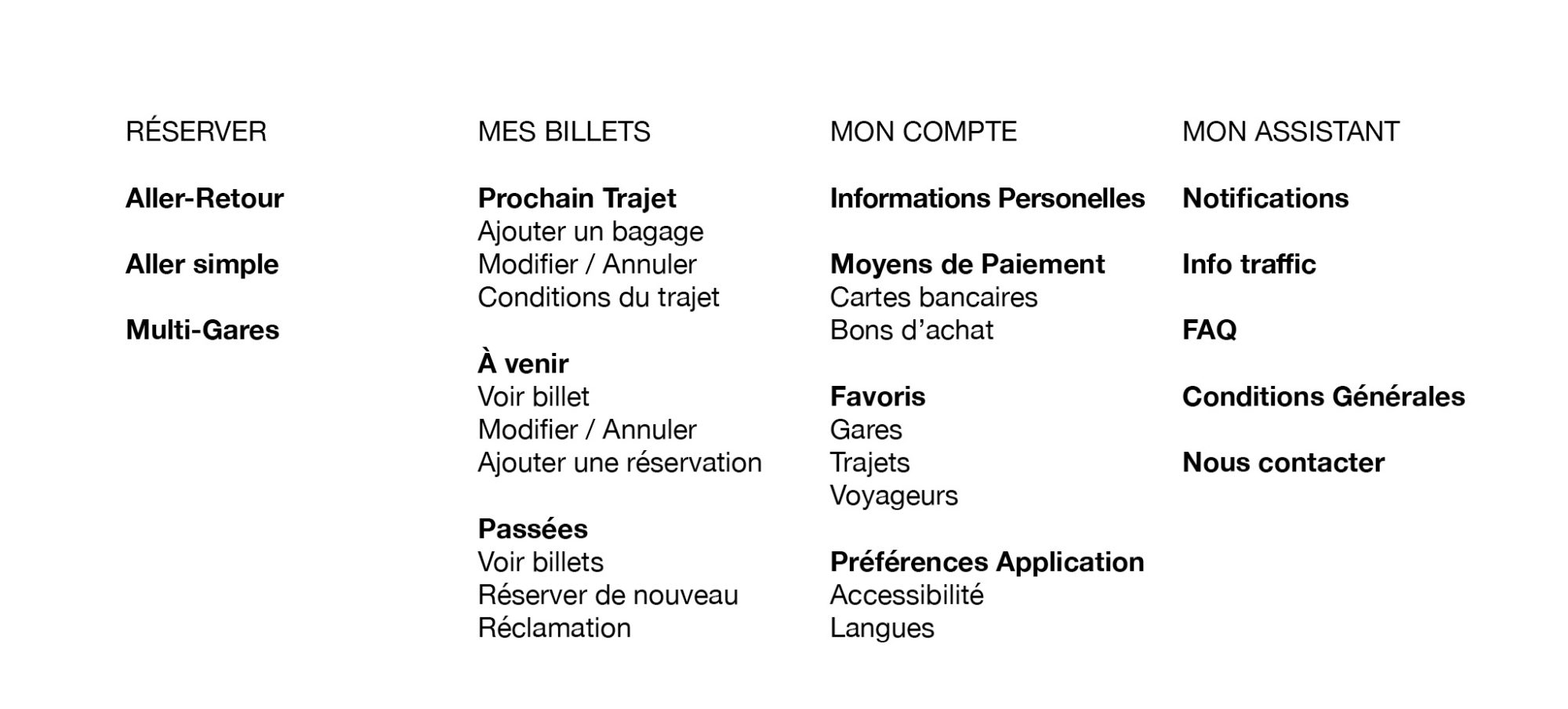
Refining the Information Architecture
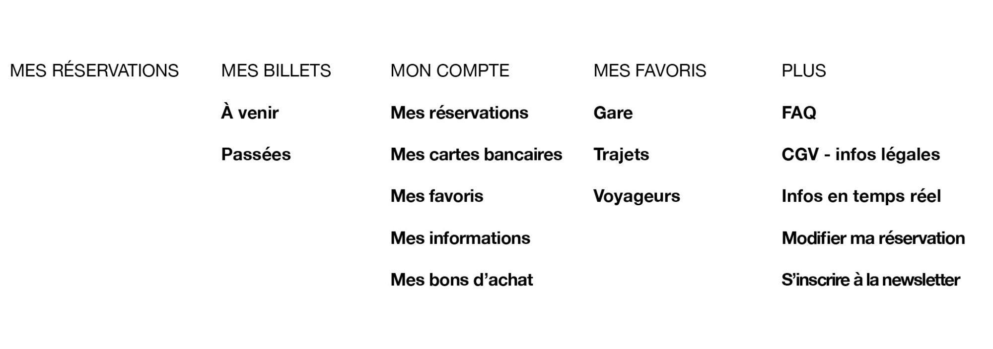
To bring clarity to the app and to remove the loops and redundancy in the original version, I reorganised the information architecture.
the first tab remains solely for booking
the second allows to access present, future and past tickets and to add new reservations
the third is related to the customisation of the app with personal info, favourite travel and payment methods
the last is focused on customer service
Using existing brand guidelines
Reading the code on the website, I reverse-engineered the visual guidelines and selected the ones that were useful for my redesigns.
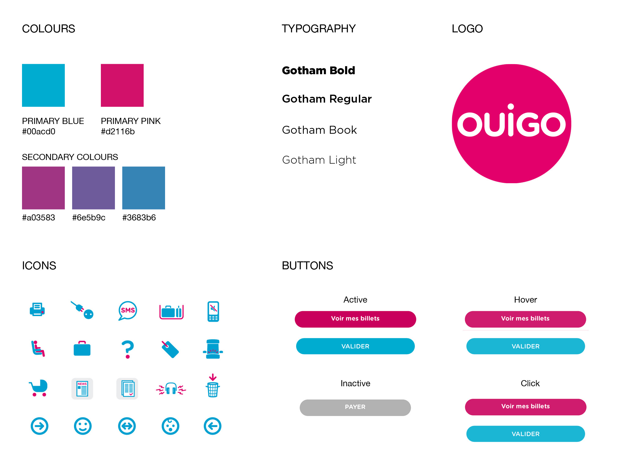
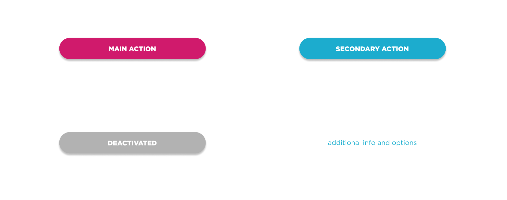
Improving the Button Hierarchy
In the original app, I observed a lack of consistency in the calls to action. For the same action, the button type changes drastically. I defined some basic rules for my redesign:
- to have a drop shadow on all buttons to invite push action
- to redefine hierarchy of colours: pink = main action ; blue = step validation or secondary action
Additional Changes
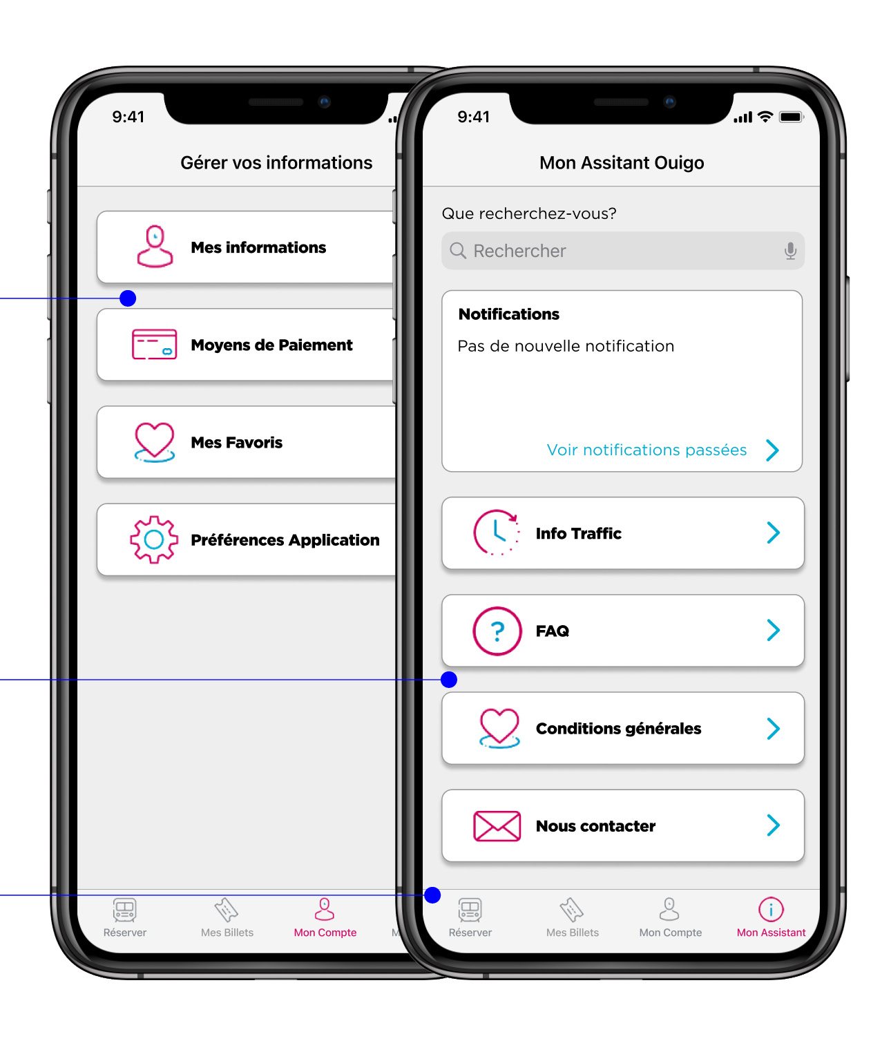
When reorganising the Architecture, I gathered all the information related to the customisation of the app under the “My Account” tab.
I created a new tab called “My Assistant” with all the info related to OUIGO's customer service and shows that they value their passengers and the importance of customer care.
Prototype
Preview on Figma of the prototype. It can also be found HERE.
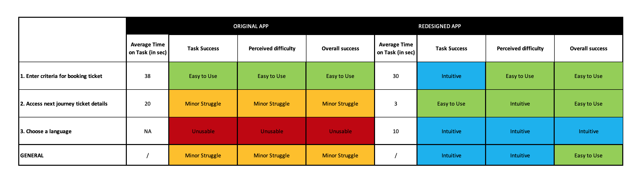
Test, Iterate, and Validate
Before / After
To test how my redesign version rates compared to the initial design, I evaluated the 3 tasks: entering booking criteria, accessing a train ticket, and changing the language on both original and revisited flows.
booking before
booking after
ticket before
tickets after
language before
language after
overview before
overview after
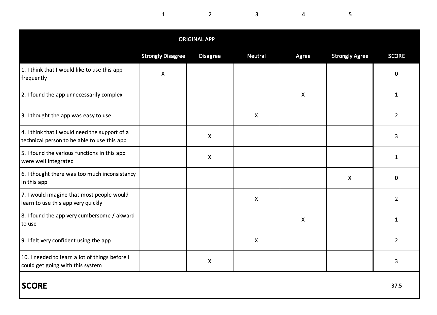
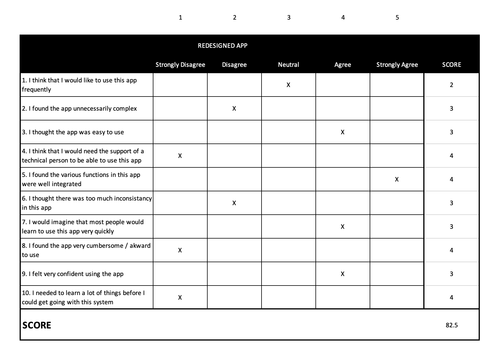
System Usability Score
Then the users were asked to complete a System Usability Scale (SUS) questionnaire.
Impact & Takeways
Test Results
The scores from the testing and the SUS questionnaire were a good indicator that the app was heading in the right direction. These results were strong enough to validate the success of the redesign.
In numbers
82.5
SUS score
A
grade
-12.5s
spent on average per task
+ From Minor Struggle to Intuitive and Easy to Use
Conclusion and takeaways
Even if I focused my redesign on the most problematic tasks, it would be worth redesigning the entire app as well as considering additional services to increase the users' satisfaction.
Here are a few other ideas that could improve the general experience:
An interactive map that tracks at what point the train is and how long is left
Tips on commute at departure and arrival as stations are sometimes outside of the city centre
Tips on how to get to the city centre and main attraction points to visit there, in partnership with a third-party company like Trip Advisor.
I understand that low cost means cutting costs but I believe that this also demands increased efficiency and rationalisation of the service. This is also true for an app experience. Cheap shouldn’t mean bad especially if most of it can be automated! The more customers are independent and satisfied, the less time and money are spent by customer service on dealing with complaints and benefits all in the long run.
